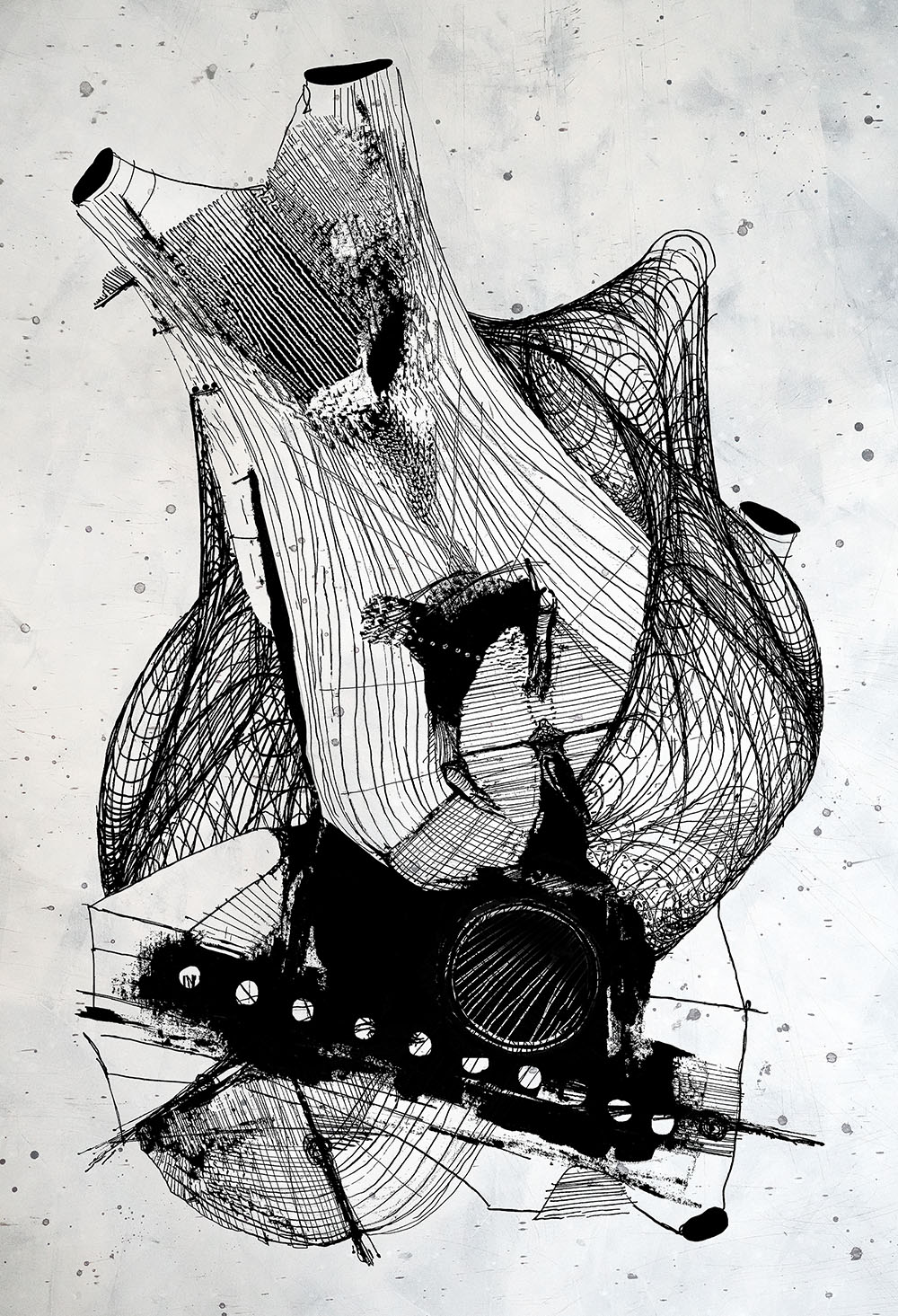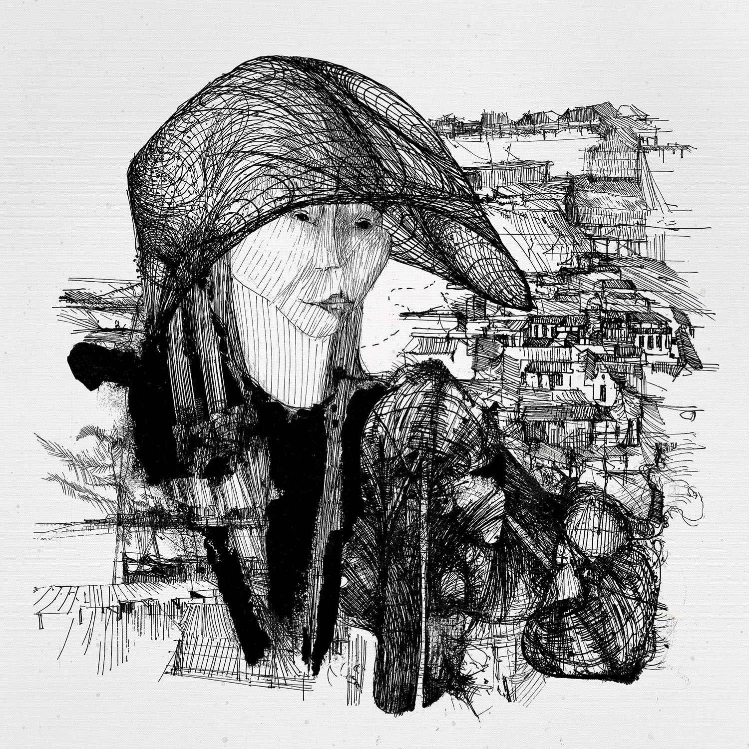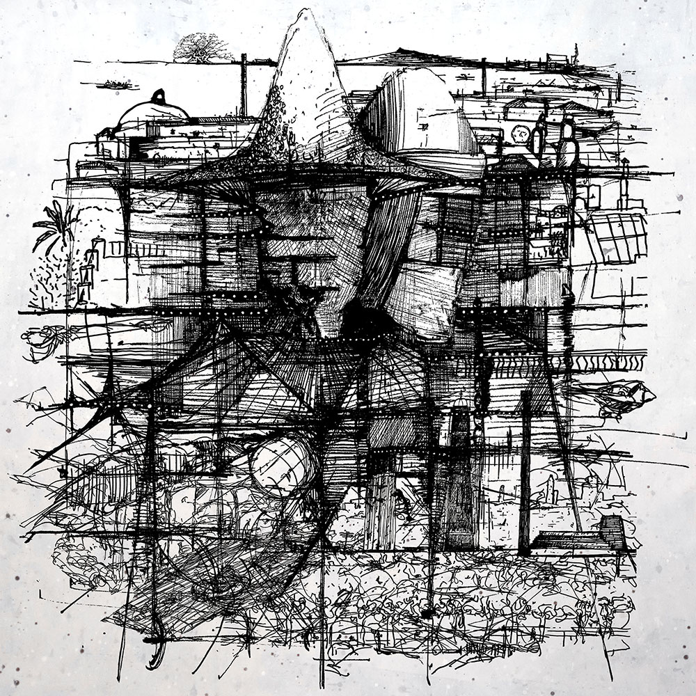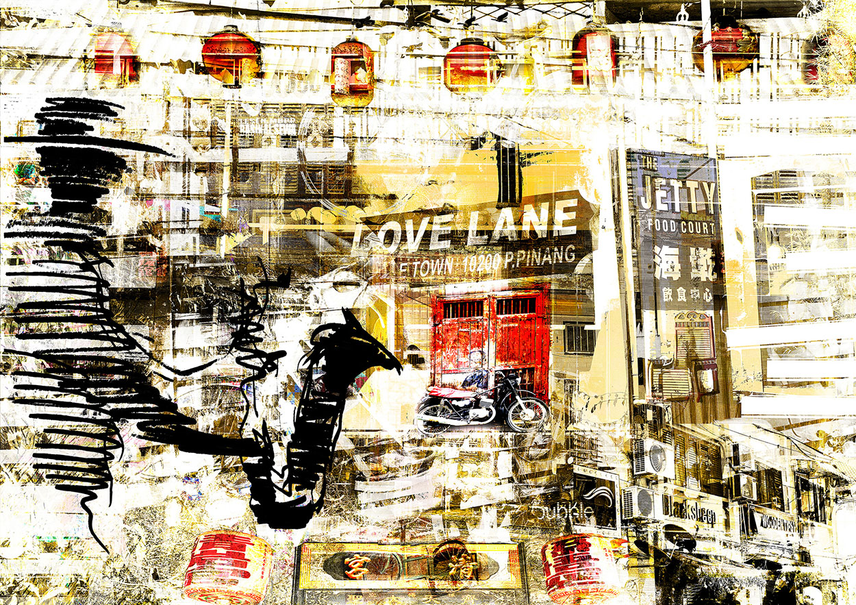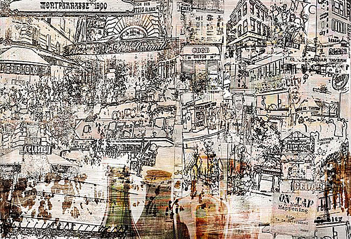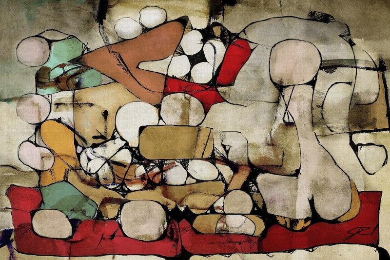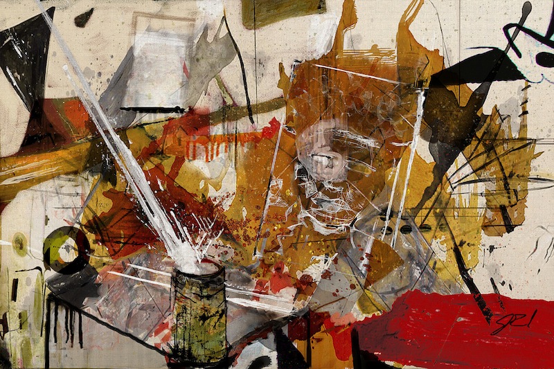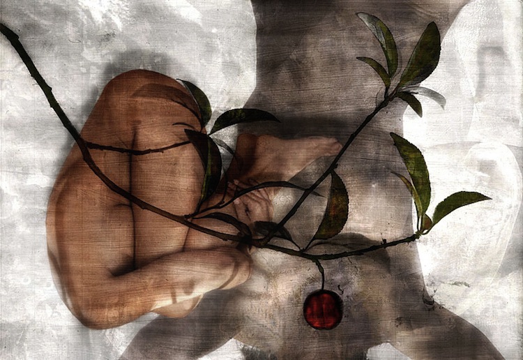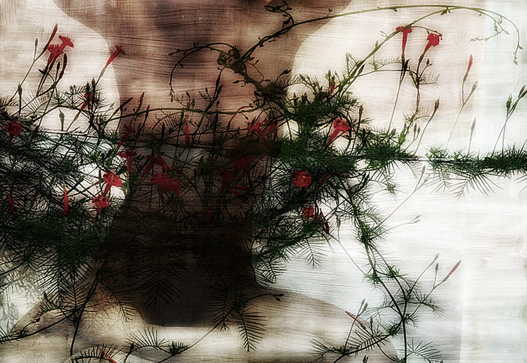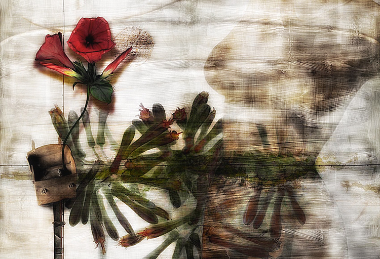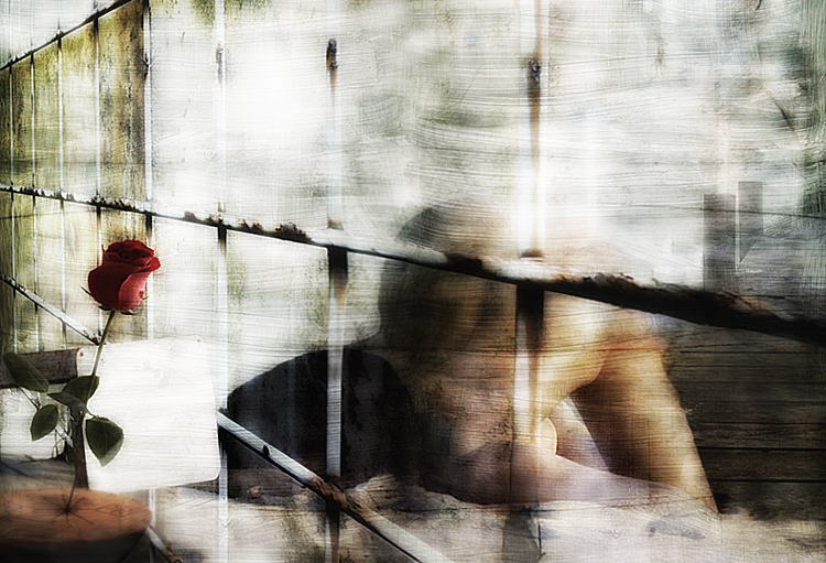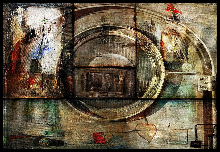
In The Weight of Memories, JP Paul continues to explore controlled random application using reverse stamping, non-traditional application tools and intuitive physical delivery in another series of intricate, heavily-textured mixed-media paintings on repurposed canvas. The artist lays down dozens of layers of lines, dots, marks, splashes and strokes to create a complex tapestry while painstakingly building exquisite over-all compositions through the partial throttling of error and chance.
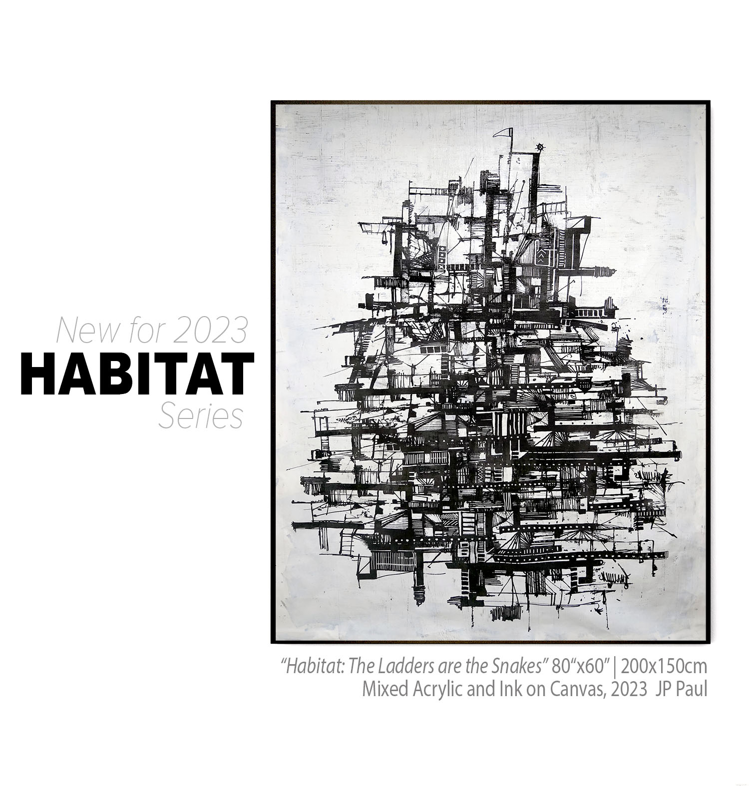
An established imaging specialist before returning to more traditional materials and methods, Paul often explores digital outcomes through analogue tools, analogue through digital, and at times both simultaneously (Also see the upcoming series, Habitat, to be released mid-2023).
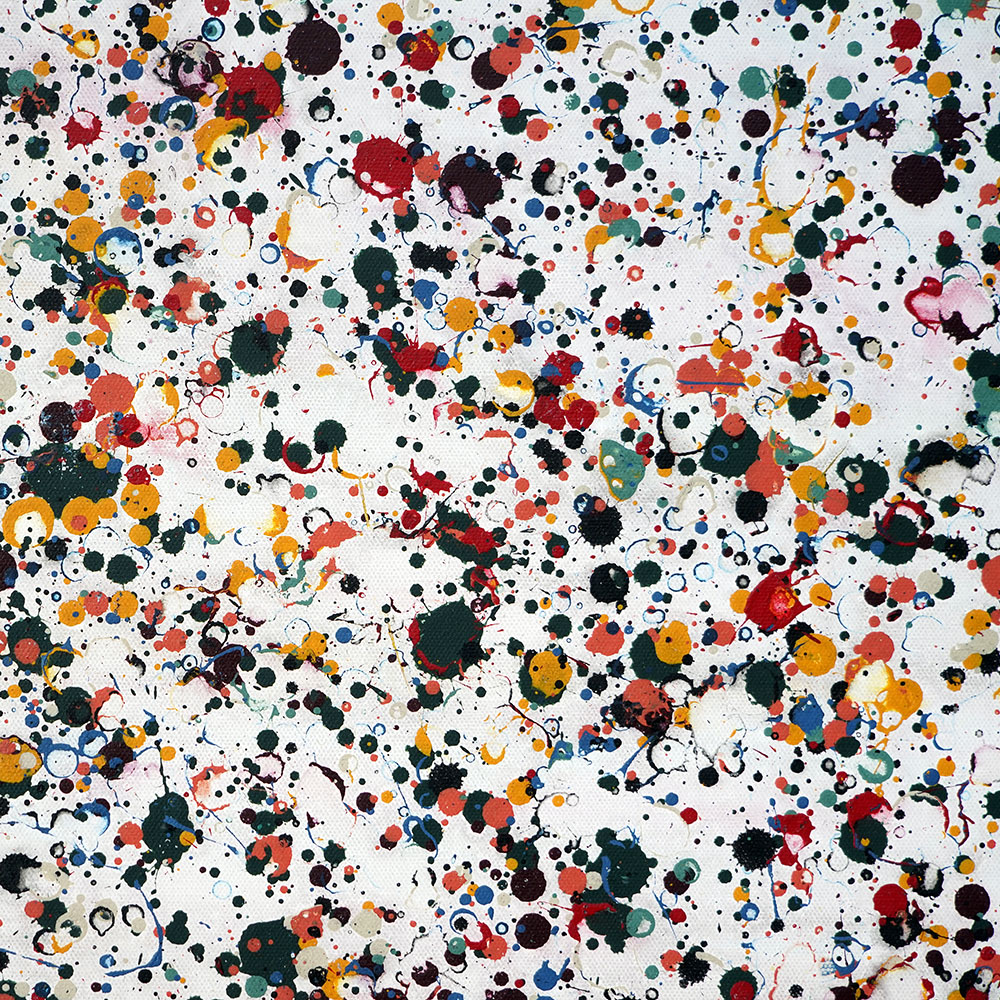
The dual memories series refer to continuous evolution, big data depictions, and relationship building between seemingly unrelated marks, dots, and negative space. On the surface, the end results are attractive abstract works. On close examination, viewers witness varied illusions caused by proximate colors, forms, patterns, and modulated density. The paint serves as the content, and the physical act of applying markings instills the energy in the works.
Weight of Memories is a continuation of the Anonymous Memories series that introduced Paul’s musings about the perpetually amended and rarely concluded nature of art and life as well as our approach to revisiting or rejecting such.
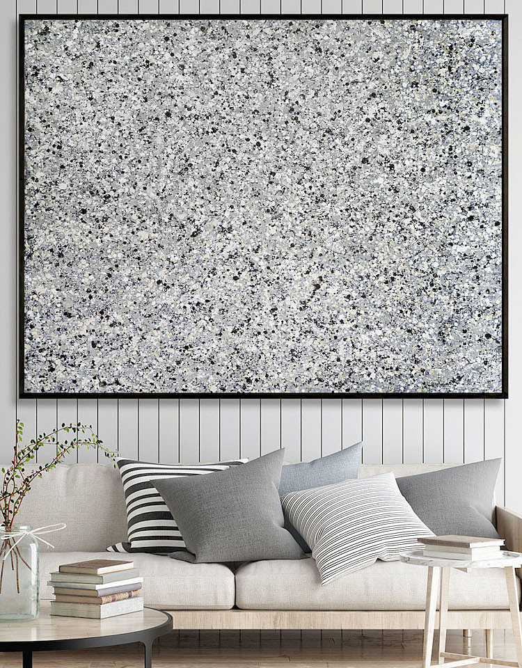
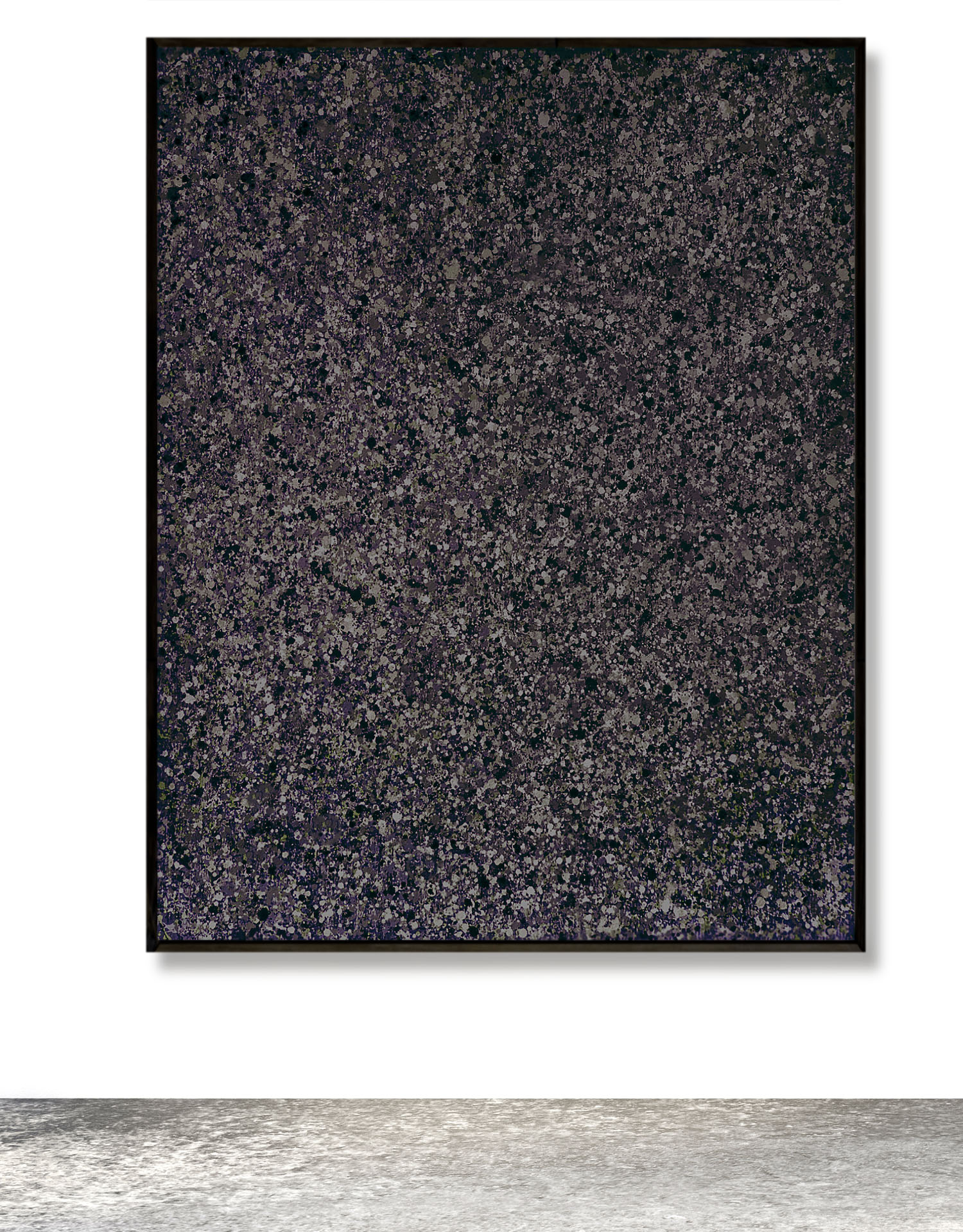
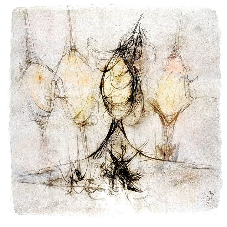
"Vertical Granite" 142x168cm Acrylic/Canvas 2023 - Image/AF Comp. for scale
See available works at AltSur
We sat down with JP to get an inside look at the new work and processes.
How many works are in this extended series, or should I say another tangent of your continuing series?
Rough estimate, in total probably 50 to 60 dating back to about 2015. I started on the original grids and the anonymous pages then moved on to muted-tone line paintings in about 2018, after which I began merging techniques into hybrids of more complex layered lines, marks and shapes. It’s an ongoing series that I plan to continue in the upcoming months and years.
Tell us a little about the significance of the “repurposed” canvas used as the substrates of this work.
As you know, I’ve worked closely with Artfronts Editions since the late 90s for my limited prints. Digital printing is not just design and press a button where everything works flawlessly on the first attempt. There are many factors of printing extra-large that aren’t always readily apparent by viewing on a computer monitor. Most digital artists print test runs at full size to expose minor drawing flaws or compositional issues that need tweaking. Certain aspects can change drastically from viewing a file on a backlit twenty-inch screen to seeing a work printed at five by seven feet or larger. The substrates also differ in their ability to manage details and support further processing, so it’s not uncommon for digital artists to run final-phase tests on our actual production canvas, papers, and acrylics.
By the time the artist has further modified the digital image before outputting the actual proofs and final prints, a substantial quantity of expensive canvas or other substrates have been used for tests. Rather than have this go to waste, we donate 50% of the leftovers to students and keep the rest for painting. Most of my latest series uses repurposed canvas after carefully reapplying white or black gesso coats over the original printed image. The canvasses are weighty enough to handle the paint, and the characteristics for painting are identical, especially for my type of work where the substrates don’t need to be perfectly smooth. Also, through repurposing, we can substantially reduce our pricing for prints because we no longer need to build in the cost of trial runs and waste.
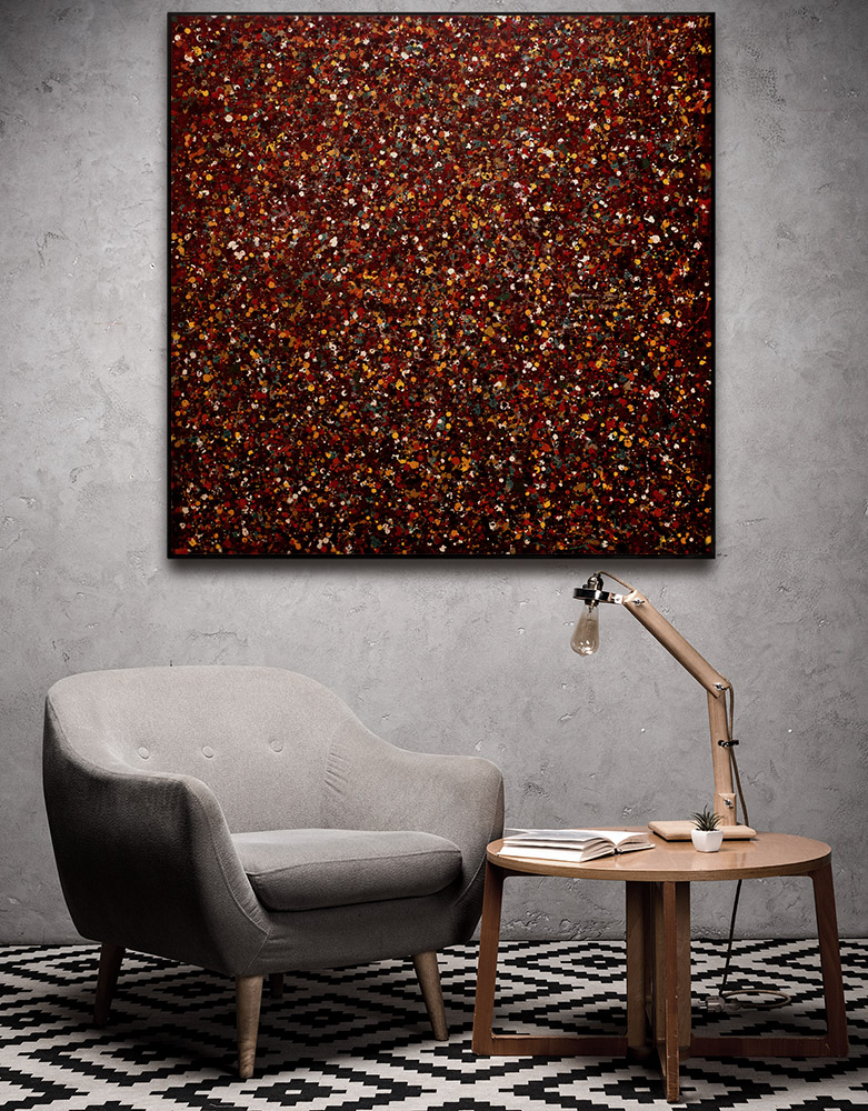
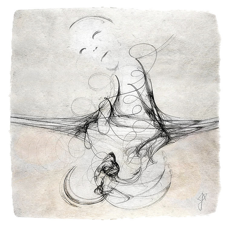
"Crimson & Clover" 122x122cm- Image/AF Comp. for scale
What is your take on physical process paintings, and in your view, what makes the work in The Weight of Memories different from previous action painters like Jackson Pollock and process painters like Gerhard Richter?
I'm uneasy discussing my work within the context of those brilliant artists, but it's true I am borrowing to some degree from action/process painters and then incorporating my own tools and techniques to the method. One similarity is the ongoing process of building works layer by layer until a certain compositional integrity is established. My paintings are not complete until the markings exhibit the desired color, balance, variable size and congruency despite the seemingly random application. I suspect Pollock and Richter had similar mental approaches that differed only in the physical acts they chose to employ coupled with the intended outcomes.
To clarify, Pollock’s drip paintings were not as random as many casual observers think. He used controlled gestures to build complex compositions featuring patterns of rhythmic swirling lines in all-over compositions where the paint itself acted as content and context. There are occasional random drops and splatters because of the nature of his process and the fluidity of the paint, but the compositions rested primarily in the deliberate lines and swirls. There is definitely intent to form patterns and instill movement, and Pollock didn’t terminate any action painting until the desired effect was achieved.
Gerhard Richter’s squeegee paintings are another example of physical application that seems easier said than done. He would often reapply the paint, either partially or wholly, and continue to build up the undercoats until the streaks and colors exhibited his intended intrigue and interplay. Each swipe of his boards was fraught with some degree of uncertainty due to the reverse nature of the paint application, how the colors would react to each other, the opaqueness vs. transparency, etc., but Richter continued the process indefinitely until the painting appeared as intended. The video of his proceess is easy to find on Youtube ( Gerhard Richter Painting) and well worth viewing, as are short clips of Pollock in action.
While their resulting works are not even remotely similar to mine, the underlying process of how they arrived at the finished paintings is essentially the same. There is also a certain amount of luck (good and bad) involved with any of these processes, but I’ve always felt that to be able to prosper from luck you need to be close to success in the first place.
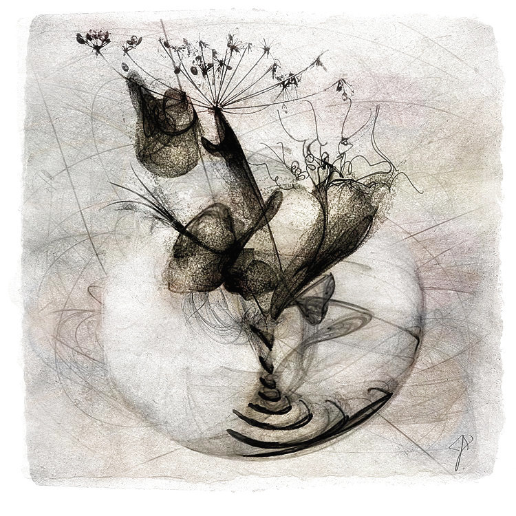
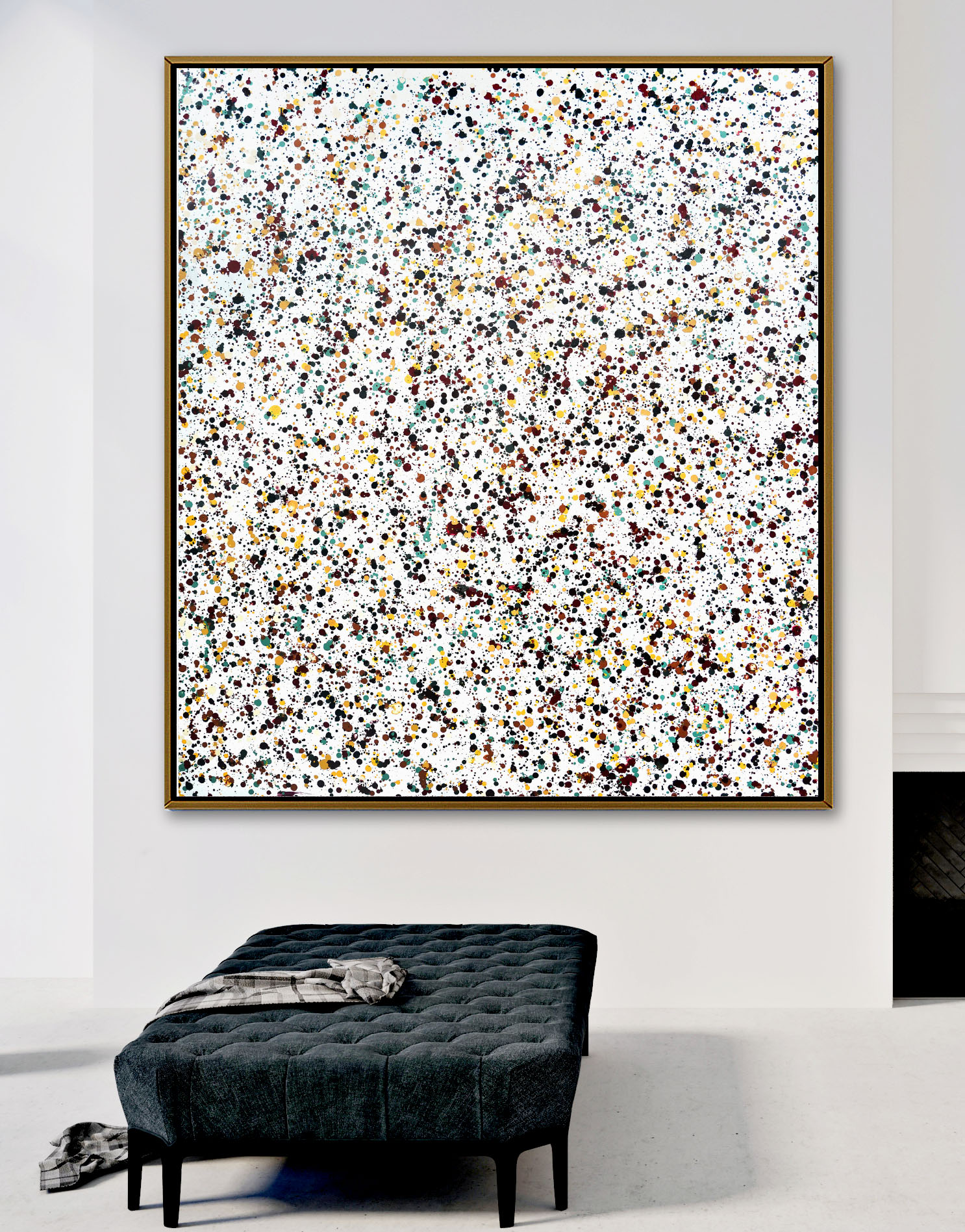
"Midnight" 152x200cm - Image/AF Comp. for scale
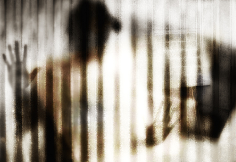
Many of my works combine methods of application that conceal flaws or further manipulate the imagery after the substrates have gone through earlier processes and transformation. For instance, some were originally highly textured paitings, others were left over from Anonymous Memories that had photographs on paper or corrugated carton embedded into the surfaces at one stage or another. This was based on the central premise that replacement images and memories were eventually overlapped with new ones, not unlike the dynamics of scrapbooks or photo albums, especially for dysfunctional families!
For these works, scraping and re-application is manipulated to allow the existing contours and protrusions to form part of the final composition. This can be seen in the image and detail of one of the works, Untitled B2, below.
In some sections, the corrugated carton pattern of an earlier work protrudes from the paint, an effect I often emulated with paint and gel medium during my earlier grids and lines phase between 2018 and 2021. As the latest series is clearly an amalgam of previous methods, I borrow freely from all of them even though the finished products appear to be very different from period to period.
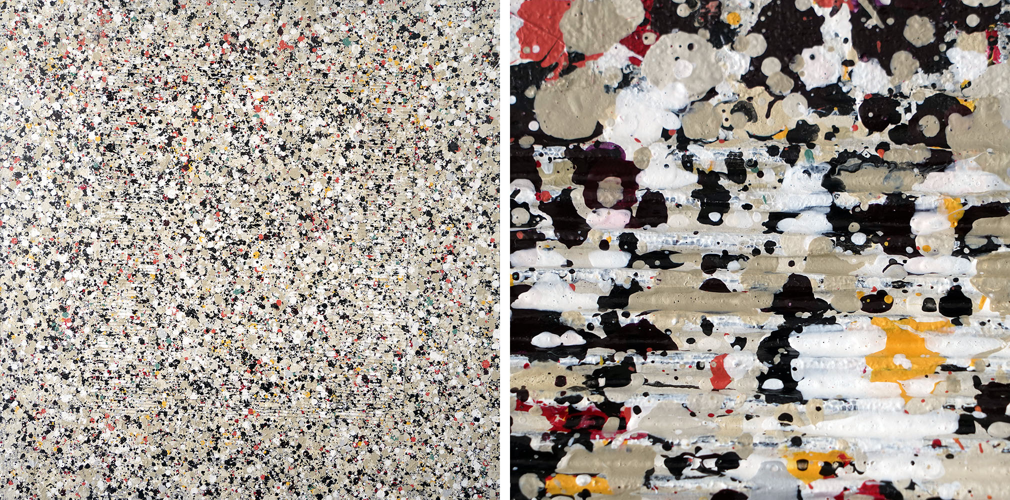
Left: Full Work | Right: Magnified Detail - Image/AF
I’ve heard you use the term “controlled randomness.” Could you explain this for those who aren't familiar with your recent work?
In my case, the exact outcome is not defined when I start. The result is loosely envisioned to some extent, but it becomes a culmination of application using pretty much anything but brushes. For example, applying gridlines is a reversed-transfer process that is very difficult to control consistently. Likewise, when you’re essentially throwing or dropping paint onto a surface from above rather than applying it directly with physical brush strokes, all hell can break loose. Through practice, I’ve learned to improve my odds by standardizing on certain techniques, for example the speed of movement, the distance from hand to canvas, the size of the applicator, and certain wrist actions. Nevertheless, many surprises still occur due to the randomness inherit in the process and the potential for variations in those techniques.
Like life itself, the end results arise from a combination of success and failure, a central theme in these and many of my series. My career would seem disengenuous if I didn't acknowledge the latter.
"Like life, the results arise from success and failure."
I refuse to accept defeat from mistakes or errors. Instead, they become opportunities to improve through revision. This allows me to explore the effects of different application tools, the transparency or opaqueness of paints, density, thickness, proximate combinations, concentrations, and more. I try to work as quickly as possible during application to keep the process fluid and intuitive, and by having several color layers wet simultaneously, this offers even more opportunities for manipulation. Once satisfied, I still have to endure a long wait for everything to set before applying subsequent layers. During these pauses, I often find ways to take a piece in an entirely different direction that adds fullness or richness to the work.
In other words, the individual processes are very fast but the overall creation takes a long time! There's no doubt that the value to me of this process is partially cathartic.
Can you describe more details of your process without giving away trade secrets?
There are no secrets. I think it's pretty clear what I'm trying to do. I start by devising the color palette. I’ll mix up a set of colors at full thickness in individual pots, then I’ll siphon off some of them into other containers to dilute them with various amounts of water. I’ll decide on a set of application tools of correct scale for the intended substrate dimensions. With various densities of paint ready to go, I can control relative sizes and pattern effects simply by how the paint flows off the instrument in use, as well as the transparency/opaqueness and the texture and thickness of the markings.
"Loose Cannon" - Image/AF Comp. for scale
I’ll continue to use the same process of applying drops and marks without physically touching the surface, and then I might scrape a wet layer to produce blended colors or lines and grids. Further stamping to create patterns can occur at any stage, and they vary depending on the wetness and consistency of the paint. This can create a unifying tone so that the subsequent layers have a balanced base. I continue to go back and forth between application of lines or dots and marks until I start to see the composition take shape. At this point, I'll start to work on smaller sections by applying spot color. I can't explain it, but I can usually tell when a work is done at the moment I hesitate to add more paint for fear of botching what's already set.
"A work feels done the moment I hesitate to add more paint..."
Another technique I sometimes use is to allow a series of dots and marks to partially dry before wetting the entire substrate with tinted water and then scraping off the wet portions of paint as the water drips off. It's a messy process, but when timed properly, it leaves only silhouettes of some of the dots and marks, thus adding depth and transparency variables to the shapes. Traces of the original color can blend in without being overbearing, and by varying the shapes the works invoke similar stories and interplay. This process is readily seen in a narrow vertical work called Untitled C1, where it was applied on one of the final layers of a loose composition. In internet pictures, it’s difficult to detect in the denser works, but in person the effects are considerably different than others in the series.
Magnified Detail of Untitled-C1 - Image/AF Detail only
After seeing these works, I can see how a viewer can stare at them for a long time and see different patterns and shapes forming depending on the lighting. What can you say about the general public's reception to these works?
It's too early to conclude anything since very few persons have seen the latest works. I'm pleased with the comments to date from those who have. I haven’t had a formal exhibition of any of these works in either of the memories series since I believe 2017 or thereabouts in La Barra, Uruguay. I have a few small works from Anonymous Memories in storage back in Uruguay, but most of the works were sold directly from my studio. The newest group, The Weight of Memories, has been entirely produced while living in SE Asia since 2020. Almost none of our regular clientele back in the Americas have seen them other than via photographs. I’ve never exhibited here in SE Asia but would love to hook up with a local gallery to see how viewers from different cultures react to this work.
As for unsolicited commentary, believe it or not the paintings have been called anything from depictions of interstellar travel to overpopulation to social chaos to mass murders. I suppose this says more about my crazy friends, the current state of our society, and the thoughts floating in the forefront of everyone's minds than about the paintings themselves, but my positive takeaway is that, after careful scrutiny, viewers are spotting several connections between the painting process and the ideas that led to these works while also connecting with the work on a visceral level. As an artist, I couldn't ask for anything more.
Any idea when this series will be complete?
Honestly, I'm enjoying them so much I don't want to stop, but other projects await. I should be finished the bulk of the series by the end of July, 2023. We'll take a short break in June and get back to some of the digital and other mixed media works that I've left dangling for a few months.
(Article written by Damien Pent. Originally published by Artfronts, January 31, 2023. Republished with permission.)